How to P#ss Off Google With Your Mobile Incompatible Site – And 5 Ways to Fix It
As of 21st April, 2015 having your website mobile friendly officially became a ranking factor for Google. This means that a website that is mobile friendly will now show up higher in Google search results than a website that is not mobile friendly (all other things being equal).
In this blog post I will show you how to check if your website is Google mobile friendly using the Google mobile test tool and what options are available for you to make it mobile friendly – along with client examples where possible for each option.
Is my site mobile friendly? Let Google tell you
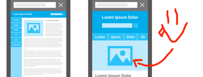
Even without using a specialised tool it should be fairly obvious to you if your website is mobile friendly or not as you can simply check what it looks like on your smartphone.
However it is also useful to check the [link]Google Mobile test tool[/link] to see if Google sees your website as mobile friendly – remember that Google doesn’t have a team of people checking every website individually to see if it’s mobile compatible – instead it uses an algorithm to find this out.
In some cases – a website may look mobile compatible to you and everyone else – however for some reason Google may not see it as mobile friendly – leading you to be penalised in the rankings.
The Google mobile test tool doesn’t give you any specific information other than a green box confirming that your website/page is mobile friendly.
Note: Google mobile test tool tests only the URL that you provide it – it is possible for example that your front page is mobile friendly while an inner page is not mobile compatible. My suggestion is just to click around the links on your website using a smartphone and see if any pages are not mobile compatible.
In most cases I find that if the front page is mobile friendly the rest of the website will be too – this is due to the way that 99% of websites are built with a common header/footer.
Help! My site is not mobile friendly… what are my options?
Below I will list a number of options for what you can do if your website is not mobile friendly – as well as the time estimate for how long this will take to implement that option – this will give you an idea of not only what options you have available but give you an idea which ones are more/less expensive.
Note that the time estimate is based on how long I estimate it would take if I was doing the work and is current as of the 3rd March, 2016.
The options include automatic mobile conversion, WP Touch Plugin (for WordPress sites), remaking the website, creating a separate mobile site and custom coding.
Automatic mobile conversion
There are online tools that will automatically convert your website to be mobile friendly at the click of a button.
Please note that this does not always come out perfect – and sometimes the automatic conversion will make your website look like a dog’s breakfast – however it is worth a shot to enter your website into these tools and see how the mobile site turns out – if the mobile site generated by these tools looks acceptable to you – then you can get a developer to redirect mobile users to the converted website.
Some of these tools are free – all though I suggest paying their small yearly fee so you do not get advertisements on your mobile sites.
http://www.mobilizetoday.com/ ($10p/m)
http://bmobilized.com/ ($11p/m)
http://www.ginwiz.com/ (starting from $30p/m)
All of these tools have a preview option so you can see what your mobile optimised website will look if it is converted using these tools. My suggestion is to pick the tool which converts your website the best.
Estimated Time: 2-4 hours
WPTouch Plugin
On the off chance that your website is powered by WordPress and is not mobile friendly then the WPTouch extension is a good option to check out. The plugin is free however the paid version gives you additional themes.
From memory – when I was installing this plugin on a client’s website – brookermarine.com.au – I found that I needed to go with the premium option since it contained a mobile template that did what I needed it to do.
For the record – while technically the WPTouch is advertised as a 1 click solution – be prepared to make some slight adjustments in the code to make sure it works correctly. The good news is that WP Touch can advise you through their support area on what code changes you would need to make.
Remember – you need to have your website all ready running on WordPress to take advantage of this extension.
Estimated Time: 3-8 hours
Remake the website
If your website is not mobile compatible and doesn’t look great on a desktop either than remaking the entire website may be an option. While this may sound like a hefty investment you would be surprised at how cost effective it can be.
For example – if your website currently has good content but bad design then you all ready have the hardest part of creating a website handled.
You can browse around and find a WordPress template in [link to WordPresss themes]ThemeForest[/link] – most templates you will find are all ready mobile friendly – and get a developer to move your content over to that new template and install it on your server.
Estimated Time: 8 hours – 25 hours
Custom coding
This is a half way option however it can be a good solution if the automatic mobile conversion option doesn’t work out and your website looks horrible in the automatic mobile conversion tool previews – your website is not built in WordPress and you are on a budget and don’t want to create a brand new mobile site or install a new theme.
The custom coding option involves adding some standardised code through various sections of the website which make them snap to the width of a mobile screen.
In certain cases I have been able to make a client’s websites usable and mobile friendly in less than 6 hours through custom coding – it may not have all the bells and whistles of a complete theme revamp however your clients will appreciate the ease of use of your new site – and you will get Google brownie points, all for a smaller investment than redoing your entire theme.
In most cases this option is a launching pad for clients to move to a new website redesign.
Estimated Time: 4 hours – 8 hours
Separate mobile site
This is an outdated practice however for the sake of having a complete list of your options I’ve included it here. To save your time feel free to skip reading this option – but read ahead if you’re curious or are just a fan of implementing bad solutions ;).
Creating a separate mobile site basically means finding a mobile template and installing it on your server – and redirecting smartphone users to that template.
This means that if you have to change some content on your website – you will need to change it on both your main website and your mobile site – which can sometimes be a bother.
My belief is that if you are wiling to invest into creating a separate mobile site you may as well either switch to a new template which will give you the same outcome and also make your main site look good.
Estimated Time: 8 hours
While it may seem like there are many options when converting your site for mobile – the options are narrowed down once you answer the question of whether you are currently running WordPress and what your budget is.
If your budget is smaller use the custom coding option. If your budget is bigger use the ‘Remake website’ option.
Finally remember that as of 21st April, 2015 having a mobile website is a must. With Google confirming that more people use their search engines on mobiles than desktops and Google rewarding mobile friendly sites (and penalizing non mobile compatible sites) – you owe not only your clients/users but yourself a favor by converting your website to mobile using one of the options above.
Leave a Reply
Want to join the discussion?Feel free to contribute!